Oftentimes, it is easier to get your point across visually using a graphic rather than with a paragraph of text. How often have you sat listening to a speaker with a slide presentation full of tables with text so small that you can’t understand what is being presented. Sometimes, the presenter will even say, “now, I know this is too small to see, but…” Why use text when a graphic or image would be better understood?
There are so many great examples of data visualization out there these days. In fact, we’ve become accustomed to these without thinking about it. Data really can be beautiful. It may seem counterintuitive to some, but numbers and words can be quantified in ways that are aesthetically pleasing. This TED Talk by data journalist David McCandless is a good introduction to the power and purpose of data visualization.
McCandless presents a great example of how to take health care research information and put into visual form with his interactive graphic related to nutritional supplements. We’ve all probably read review articles with tables of information from the studies reviewed that literally go on for pages and pages. Many of us (myself included) sometimes skip over these tables entirely. It’s just data and word overload. McCandless and his colleagues did a huge systematic review, but presented the information (data) visually in a way that is easy to understand, imparts meaning, and allows the viewer to ask and answer questions. That, in my opinion, is the beauty of data visualization.
Visualization of data related to health and health care is not a new concept. Florence Nightingale is remembered for a lot of things in nursing. One thing that she is known for outside of nursing and nursing science is her love of statistics and numbers. Part of her enduring legacy hinged on her mastery of data visualization, as seen in this video.
And think about the power of graphics and images. Individuals around the world instantly recognize the golden arches of McDonald’s or the red Coca-Cola logo. While not the same as infographics, this iconography speaks to the simplicity and impact of graphics and images to share information. So, how do we combine data and graphics? By using infographics.
Infographics are graphical representations of information presented in a way that is meant to make the information being presented easy to understand. Within the IFNA Communications Committee, we’ve taken to calling these IFNA-graphics. As a member of the Communications Committee, I’ve developed an infographic for the IFNA Position Statement on Pre-Licensure Family Nursing Education, and there are plans to develop more infographics, particularly for the IFNA Position Statements.
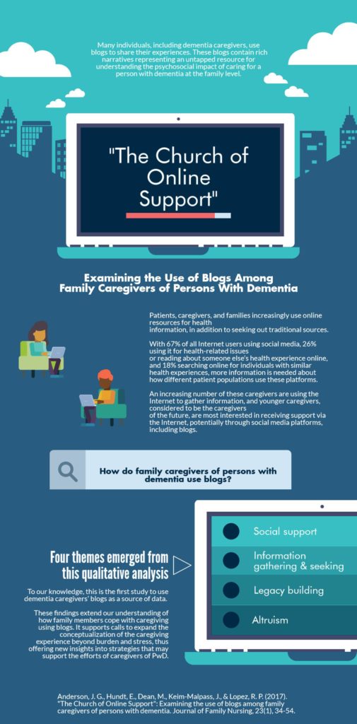
But I’ve also dabbled with creating infographics of some of my recently published papers. Sometimes referred to as visual abstracts, these simple graphics are a way for me to disseminate my work (usually via Twitter) to increase readership of my research. For example, the infographic below is one that I created, using Piktochart, for my article published in the Journal of Family Nursing last year.
According to this post from Fast Track Impact, when creating an infographic from your latest paper, you should:
- Extract your key messages
- Simplify your language
- Visualize your key messages
- Come up with a layout
- Convert to graphics
- Have a plan for communicating your infographic
This blog post on Edge for Scholars also outlines a method for developing an infographic from your latest article.
Another resource for ideas about the design of infographics is www.infographic.city. And Happify is one website that frequently uses clever infographics to display the “science” behind their interventions such as the science of happiness or the science of giving.
Wouldn’t it be great to create and share family nursing and family focused infographics on Twitter and social media related to education, research, and practice? I think it would be a great way to spread the word about the great work that the members of IFNA are doing to improve the health and wellbeing of families worldwide. If you do, be sure to tag IFNA (@IFNAorg) so that we can boost your message!
Joel G. Anderson, PhD, CHTP, is an Associate Professor at the University of Tennessee College of Nursing and a member of the IFNA Communications Committee. His research focuses on support of family caregivers and persons with dementia. He uses social media as one way of examining the family caregiving experience. You can follow him on Twitter at @JoelAndersonPhD or read his blog.

